
Understanding Google’s New Search Update
It’s here.
A new update from Google that will allegedly throw a wrench into their current search ranking algorithm unraveled on Tuesday. The new update as announced by Google will change their SERPs (search engine results pages) to start favoring mobile friendly web sites.
What does this mean?
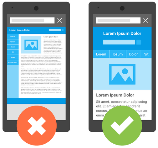
Well, for starters it means, that at the very least, your website needs to be mobile friendly! This means your website should either be responsive or direct to a separate mobile web experience altogether to keep up with todays internet standards. With well over 50% of internet users, it’s no surprise to see Google finally stressing the importance of mobile as a relevance factor. This is the first time however that they have incorporated anything with regards to “mobile friendliness” when determining their search algorithms.
There is no needs to panic here! From everything we’ve heard and seen, this is not going to be some dramatic overhaul of search rankings worldwide. I know people in various industries who have maintained their same website design since 2009 because they have always been near the top of the rankings for respective keywords and they are understandably concerned.
If a having a new website developed isn’t in the budget right now, there are several quick fixes around this.
If you are running a mainstream website on WordPress, Magento, Drupal or even Joomla, there are plenty of plugins and extensions that will create a mobile website for you. There are some free ones and many other great options all under $100. Just check out the plugins and extensions directory on each.
If you are on a regular custom coded html website you can always create one yourself by redirecting to a separate mobile site. It would display something like “m.yourdomain.com”. You can find out how to do this by going here.
If you are not sure about how Google sees your website, they have provided a cool tool that let’s you how mobile friendly your site is.
Once you have cleared the danger zone and you are in the mobile club, let’s discuss how you can optimize your mobile experience for better rankings.
Responsive vs Mobile websites, the Pro’s and Con’s
Responsive Websites
First, responsive is definitely a great choice, but it is not necessarily the best option. A typical responsive website has all of the same content as its desktop counter parts, only the content is altered or arranged to fit the size of your browser and in this case, phone or tablet. This is terrific for display purposes and in most cases, it stacks items that would usually be side by side in order to give the user an optimal view of everything on the website. This is a wonderful function in current web design and it can really help the experience on most medium to minimal content websites. Where we start to run into problems is when we are dealing with websites with a lot of content. Most visitors coming to the website on mobile are either using a 3g or 4g smart phone and depending on where they are, loading all of that content might be a problem and Google will penalize you for it. They are pretty open about website loading time being a factor and have even posted tools on how you can test and improve your current site.
Also, the sheer amount content that you display might have a different effect on users depending on what device they are using. If you have too much copy, then someone might forgo certain call to actions because they just don’t have enough time on the go to check it out which could lead to some lost business. Here is a great article that breaks down the nuts and bolts of it.
Mobile Websites
Mobile website definitely have their upside as you can cater all of the content that you need for it and even take into consideration items like load time and mobile oriented content. There are a few major setbacks to this approach. First, is that you will now have to maintain two websites and update both accordingly, and even if you having the mobile site aggregate the same data, you still have two websites to create when rebranding or making design alterations. The other problem is the use of using the “m.” before your domain. This is awful when people are sharing pages from a mobile device and lead people on desktops to viewing something like this.

instead of

How do I optimize my mobile website then?
There is really no right or wrong way, published at least, on how to optimize your website with mobile further from Google. That being said, there are methods that when using certain analytics and metrics show grab a better user engagement and that is something Google shoots for. They want to give you the best possible, useful and relevant results that you are looking for. So why not give them just that?
Neil Patel, an author for the content marketing institute came out with a terrific article on how to create great content for mobile and get more engagement from it. It will help with creating more interesting headlines and how to shorten content for better load times as well.
He sums up this journey by saying, “Don’t write less. Write better.”