

Sacramento Kings ReBrand
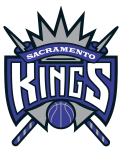
The Sacramento Kings re-branding is definitely a step in the right direction. Jousting sticks in purple can only do so much. These new ones have a Premier League feel and that’s not a bad thing.
Solid color logos have many marketing environment options and can be colored endlessly depending on the backdrops.
The modern touch (flat) of traditional icons (use of lions symbology for royalty – team’s name are “Kings”) makes it perfect for 2016. Take a look for yourself.
Current logo
Proposed new branding logo elements
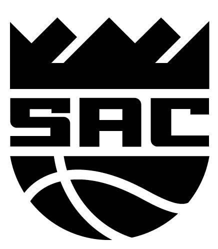


It hasn’t been confirmed by the team yet as they have only applied for the trademark, but if it does go through, then this will be a step in the right direction for a team struggling mightily for relevance and ticket sales.

Recent Posts